Profile
 Dashboard
 Logout
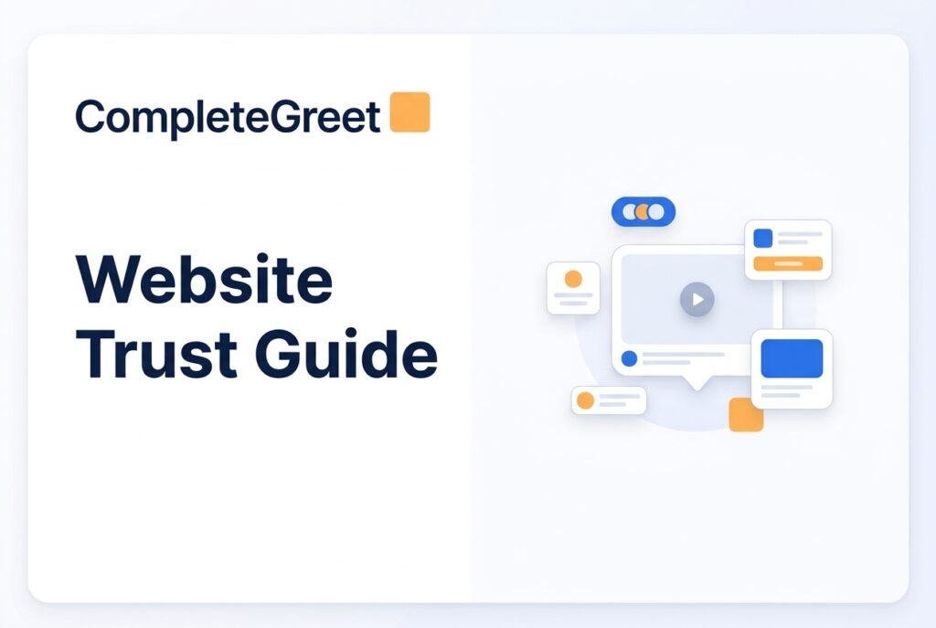
Table of contents
Key takeaways
- People decide whether they trust your site in about 50 milliseconds. That’s before they’ve read a single word.
- Trust signals boil down to three things: proof you’re a real organization, proof you’re actually good at what you do, and proof it’s safe to hand over money or personal info.
- Video wins the trust race because our brains read faces, vocal tone, and body language almost instantly, while text demands focused effort and patience to decode.
Here’s the thing about trust on a website: it starts the moment someone sees a real person behind the business. Within seconds. Trust badges and long About pages? They help. But nothing hits quite like a real human face greeting your visitor right when they arrive.
Video works faster.
Danish ecommerce store Soccerplay.dk saw a 48% jump in inquiries after they added a personal video greeting to their homepage. Turns out, a real face changes everything about how people judge your credibility.
Most trust building advice out there zeroes in on design polish and social proof widgets. And sure, those matter. But they completely miss the immediacy of an actual person speaking to what the visitor needs right now.
CompleteGreet zeroes in on this one trust mechanism instead of trying to be a chat tool or a survey platform, which means it’s not the right fit if you need complex branching logic. But setup? Under ten minutes.
You can get it running on Shopify, WordPress, Wix, Squarespace, Webflow, WooCommerce, or custom HTML and React builds in the time it takes to finish a cup of coffee. And speed matters here, because trust decays fast.
What makes a website feel trustworthy in the first few seconds?

Your visitors make a trust decision within 50 milliseconds of landing on your page. Think about that. They haven’t read your headline. They haven’t scrolled to your value prop. Their brain is already processing visual hierarchy, color consistency, and whether there’s a human face on screen, all before a single word registers.
The video first impression website research backs this up: seeing a real human face in the first viewport boosts perceived credibility far more than stock photos or clever copy ever could. This isn’t about making things pretty. It’s about tapping into pattern recognition we’ve had since we lived in caves.
Three things matter most in those first milliseconds. First up: visual consistency. Mismatched fonts, clashing colors, broken alignment, your brain reads all of that as risk, even if you can’t articulate why.
Second is what I’d call professional density. Too much white space and a site feels hollow. Too much content and it feels desperate. A medical clinic’s site looks different from a creative agency’s, obviously, but both need to look intentional.
Third, and this one’s huge, immediate clarity about who’s behind the site. Anonymous websites make people suspicious. Full stop.
Nielsen Norman Group research backs this up. Users lean heavily on surface cues during that initial scan. They’re not reading your copy yet. They’re checking whether your site looks like other sites they’ve trusted before.
Mobile loading speed plays into this too. If your site takes three seconds to load on 4G, you’ve lost trust before the visual assessment even starts. That blank white screen? People read it as broken.
Here’s one thing most teams completely miss: the cursor state. On desktop, a custom cursor that lags or behaves weirdly creates this tiny friction that chips away at trust. Fix that before you spend hours agonizing over headline copy.
Your favicon matters more than you’d think in this subconscious audit. A generic WordPress icon or some blurry 16 by 16 pixel image screams “this site is abandoned” or “this is temporary.” Swap it for a crisp SVG that matches your brand colors exactly.
A Danish ecommerce store selling custom furniture learned this the hard way. Their bounce rate was stuck at 78%, until they figured out their mobile menu icon was rendering as a gray box on iOS devices. The fix was dead simple. They swapped the SVG and added a phone number in the header. Bounce rate dropped to 54% in two weeks.
Tiny visual bugs signal operational neglect.
Motion patterns matter too. Elements that slide in too fast, carousels that auto play without asking, they feel unpredictable. And our brains interpret unpredictable motion as a potential threat. Keep your animations under 300 milliseconds and always respect the prefers reduced motion setting.
Want a real gut check? Pull up your site on a $200 Android phone running 3G. If the hero image loads pixel by pixel or the text reflows three times before settling, you’ve already lost the visitor.
One more thing: scroll up and down quickly on a mobile browser. Watch your sticky header. If it jumps, vanishes, then reappears, that stuttering tells people something’s broken under the hood.
Which trust signals matter most on a website?
Trust signals break down into three buckets: proof that you’re a real organization, proof that you’re competent at what you claim, and proof that it’s safe to do business with you. Most sites nail one or two and completely drop the ball on the third.

The first bucket, legitimacy, covers basics that should be obvious but somehow get buried all the time. A physical address with a real street and city, not just a PO box. A team page with actual humans who have LinkedIn profiles you can click through to. A phone number someone actually picks up. One Danish hair salon added a video greeting showing the real stylists in their real salon and saw 42% more bookings within sixty days. Visitors also stuck around 33% longer. The video didn’t say anything groundbreaking. It just proved the place existed and the people were real.
The second bucket, competence, is where businesses tend to overdo it. Endless feature lists don’t build trust. Specific outcomes do. Case studies with real client names (when you’ve got permission), testimonials with actual faces, and concrete metrics all outperform vague claims about “innovative solutions.” SaaS companies struggle here especially because the product is intangible. A video widget for SaaS companies that shows the founder explaining the product in plain English while looking right at the camera? That single clip often converts better than a sprawling ten page feature tour.
The third bucket, safety, is the one teams skip almost every time. Yes, it includes the obvious technical stuff: valid SSL certificates, clear refund policies, privacy policies written for humans and not just lawyers. But it also includes speed. Per Google Web Vitals guidance, your Largest Contentful Paint should land within 2.5 seconds for a good user experience. Every second beyond that chips away at trust before anyone even reads your headline. One ecommerce store selling sports gear tightened up their load time and added a video greeting from the owner. Inquiries shot up 48% and time on site climbed 26%.
The order you show these signals in matters too. Put safety markers early, visitors subconsciously check for security within the first few seconds. Roll out competence signals once they start engaging with your offer. And prove legitimacy continuously, especially at checkout or on contact forms. Teams that lead with the wrong signal, like featuring an “About Us” video on a homepage that still takes five seconds to load, are missing the point entirely.
Case studies hit hardest when they include real numbers. A Danish information platform documented a 44% increase in inquiries and 28% longer sessions after adding video. Those are the kinds of specifics people actually remember.
One practical thing most teams overlook: put your refund policy on its own dedicated page. Don’t bury it in terms of service. Link to it directly from product pages and checkout flows. Visitors who actually click through to read that page convert at measurably higher rates, because just reading it lowers their sense of risk. The page doesn’t need to be long. It just needs to be easy to find.
An interactive, style infographic showing six trust signal questions to assess your website’s trustworthiness, with scoring bands and real case study results from Danish businesses that added video greetings.
Website Trust Score Calculator
Count your “Yes” answers to see your trust gap
Do you display real team photos or a video greeting?
Is your contact information (phone/email) easy to find?
Do you show customer reviews or testimonials?
Is your site SSL secured (HTTPS in the URL)?
Do you have clear return, refund, or guarantee policies?
Does your site load in under 3 seconds?
Source: CompleteGreet case studies, 2023
See the static HTML data above for the full breakdown.
How does video help build trust faster than static text?
Video builds trust faster for a simple reason: your brain processes a face, a tone of voice, and body language in milliseconds. Text? That takes real effort. You have to actively read, decode, and sustain attention. Static copy can list every credential perfectly and still leave people cold because it can’t deliver warmth, eye contact, or that subtle pause that signals someone’s being honest rather than just selling.
The numbers tell the story. A Danish hair salon added a straightforward greeting video and saw 42% more bookings plus 33% longer sessions. An information platform measured 44% more inquiries after making the same simple change.
These aren’t marginal gains.
What’s happening is that the uncertainty of dealing with an anonymous website evaporates the moment visitors see who they’re actually dealing with. Facial recognition is hardwired into us. When someone sees a founder, a stylist, or a support lead speaking directly to camera, their brain treats it like a real social interaction, not a marketing pitch. That mental shortcut leapfrogs right over the skepticism that normally builds while people read polished sales copy.
And the benefits don’t stop at first impressions. When you build personal branding with video, you create continuity across every page where that same face shows up. It reinforces the feeling that a real human stands behind this whole operation. When someone clicks from homepage to pricing to contact and keeps seeing the same video greeting bubble, the site stops feeling like a faceless machine and starts feeling like a shop where the owner’s standing right at the counter.
Here’s something else static text can’t pull off: conveying intent. Written claims about “transparency” or “customer focus” read exactly the same whether they come from a trustworthy business or a scam site. Video layers in all the signals humans evolved to rely on, vocal tone, a genuine smile, those micro expressions that telegraph competence without coming across as arrogant.
Most teams seriously underestimate how much uncertainty their visitors carry around. A first time visitor has no idea if you’re a solo freelancer, a well funded startup, or a shell company. A 30 second video greeting answers that question silently. It shows the office. The team. The workshop. It proves you’re real without demanding anyone click through to an About page.
But here’s the detail that matters more than production quality.
Videos that auto play on mute with clear subtitles outperform polished, high budget productions that make visitors click to start. People want proof before they commit their attention. Force them to click play and you’ll lose them. Let the face speak silently and they’ll unmute once curiosity grabs them.
This is exactly why the same budget spent on video greetings tends to outperform copywriting overhauls when it comes to trust metrics. Text explains. Video proves presence. And presence is what closes the credibility gap in those crucial first ten seconds.
Where should you place trust building video on your website?
Where you put your trust video matters just as much as what’s in it. And most sites see the biggest payoff when they match the greeting to what the visitor’s thinking at each stage of their journey. A video that works on your homepage will fall flat on a checkout page. A detailed explainer on your pricing page can feel weirdly out of place on your contact page. The trick is mapping each video to the specific hesitation visitors are likely feeling at that moment.
Homepage and landing pages
Your homepage video should answer one question: who’s behind this business, and why should I stick around? Keep it under 30 seconds. Soccerplay.dk, a Danish ecommerce store selling sports gear, placed a short greeting from the founder on their homepage and saw a 48% increase in inquiries along with 26% more time on site. The video sat in the bottom right corner, popping up after a 2 second delay so it didn’t block the product grid. Most visitors never clicked to play audio, but just seeing a real face there was enough to lift trust and drive action.
About and team pages
About pages get treated as an afterthought all the time, but here’s the thing, they’re exactly where people go when they’re this close to converting and just need that final nudge of reassurance. Frisor Sadon, a Danish hair salon, put a 20 second greeting from the head stylist on their about page and saw 42% more bookings plus 33% longer sessions. The video showed the actual salon interior, not some stock background. When you want to measure roi video widgets properly, keep your about page metrics separate from homepage metrics so you know which placement is actually driving results.
Service pages are a different animal.
Service and product pages
Find din ppo.dk, a Danish information platform, placed video on their main service explanation page and measured a 44% increase in inquiries and 28% longer sessions. These pages work best when the video addresses the specific outcome the visitor’s after, not some generic welcome message. The Danish site kept it direct: “I’ll walk you through how this works in under a minute.” No music. No effects. Just a person speaking clearly to the camera.
Pricing pages almost never get video. That’s a mistake.
Pricing and contact pages
A short video on your pricing page that says “Here’s exactly what you get at each tier” strips away the ambiguity that kills conversions. Contact pages benefit from a video that sets expectations around response time. Something like: “I check messages twice daily, usually within 4 hours.” That one line cuts follow up anxiety more than any automated reply email ever could.
You probably don’t need video everywhere to start. Pick the page where your analytics show the steepest drop off between visit and conversion. Test there first, see what happens.
Most websites bleed visitors within the first few seconds because subtle trust cues are either missing or too weak to register. These cues work below the level of conscious awareness, but they’re what actually determines whether someone stays or bounces.
This checklist breaks down the specific signals that shape visitor behavior. Run through it before you spend another dollar on traffic acquisition.
The seven trust signals
Trust signals fall into three categories: transparency, credibility, and accessibility. Transparency means a clear physical address, identifiable team photos, and upfront pricing. Credibility covers fresh customer reviews, security certificates, and consistent, professional design.
Accessibility means your site works on mobile and loads quickly. It also means complying with W3C accessibility guidance so people using screen readers and other assistive tech can navigate without hitting walls.
How the scoring bands work
Sites with zero to three active signals fall into the weak trust band, and bounce rates there typically blow past seventy percent. Four to five signals put you in the mid range, where visitors hang around but hesitate to actually convert.
Six or more signals give you a strong trust foundation that supports steady inquiry rates and keeps bounce rates low.
Why video accelerates trust repair
Video acts as a multiplier. It can bump a site up a full trust band without touching any of the underlying infrastructure. A 30 second greeting from a real team member adds human presence in a way that static elements just can’t match.
Sites sitting in the weak or mid range get the fastest wins by recording a perfect video bubble message, way faster and cheaper than a full redesign. It’s also a natural way to build personal branding with video and stand out from competitors leaning on text alone.
Focus on plugging gaps, not polishing what already works.
A site with three signals gains way more from adding a fourth than a site with six gets from adding a seventh. Video delivers the highest return per hour invested when you’re trying to climb from weak to mid range trust. So start with a simple greeting shot on your phone before sinking money into elaborate redesigns that might not even address the real credibility gap.
Common questions
Is CompleteGreet cheaper than VideoAsk for a small business website with moderate traffic?
For most small businesses, yes. CompleteGreet charges a flat rate with no per minute fees. VideoAsk bills by processing minutes, so once you hit 100 or 200 minutes you’re stuck upgrading or shutting off responses. CompleteGreet doesn’t cap your interactions. Whether ten people watch your greeting or ten thousand, you pay the same.
How long does it take to set up CompleteGreet on a Shopify or WordPress site?
Under ten minutes for most businesses. You copy one embed code, paste it into your site header, and you’re done. No developer needed. The widget shows up right away on every page you choose.
What website platforms does CompleteGreet actually work with?
Shopify, WordPress, Wix, Squarespace, Webflow, WooCommerce, and anything that lets you add custom HTML. It runs on React, Vue, and other JavaScript frameworks too. Basically, if you can paste a snippet, it works.
Should I use CompleteGreet or VideoAsk for collecting leads on my service business homepage?
Go with CompleteGreet if you want a trust building greeting without stressing over usage limits. VideoAsk is the better pick if you need multi step surveys or conditional logic flows. CompleteGreet does one thing really well: putting a real human face on your business the second someone lands on your site.
What kind of trust or conversion results do businesses see with CompleteGreet?
Businesses using CompleteGreet consistently report more inquiries and longer time on site. When visitors see a real person greeting them, they’re noticeably more likely to fill out a contact form. The effect is especially strong for service businesses, coaches, and agencies, anywhere trust matters more than price.
Does CompleteGreet have any limitations I should know about before signing up?
It’s built for trust and greetings, not for heavy surveys or chat first workflows. If you need branching logic, multi step questionnaires, or AI chatbots, this isn’t your tool. But if you want a simple, effective video widget that builds trust the moment someone arrives? That’s exactly what you get. Nothing more, nothing less.